In previous posts, we talked about how to give a great presentation, and how to avoid clutter using the 5/5/5 rule. In this post, we will focus more specifically on designing your slides.
Great presentation design is not as difficult as you think. Effective design is all about organizing information clearly and logically. When information is well-organized, your presentation will automatically look good. By following a few key principles, you can create presentations that not only inform but also captivate your audience.
The Importance of Layout in Presentation Design
Imagine your presentation slide as a well-organized city. Just like a city needs a grid to arrange buildings and streets, presentations benefit from a grid system. This invisible grid helps you to align elements, create consistent spacing between elements, and maintain proportional balance. A popular choice is a 12-column grid, because it’s highly divisible, allowing for flexible layouts. In PowerPoint, this grid is easily shown via View → Show → Gridlines.
Once you have a grid, you can use it to place information on your slide in an organized way. Think of your content as different city districts. Each district (or topic) can be represented inside a box. This technique will make sure that related information is grouped. A box could have lines along each side, but you could get creative by (for example) removing some of the lines of the box (see example below).
When using boxes, be aware of the margins. Margins act as the breathing room between the boxes. It is important to keep your margins the same on all sides (top, bottom, left, right), and make sure they are larger than the line spacing between text lines. This creates a sense of visual hierarchy and prevents clutter in your presentation design.

The Importance of Typography in Presentation Design
Typography, or the art of choosing fonts, also plays a crucial role in effective presentation design. Here are some basic typography tips to keep in mind:
- Scale: Use font size to indicate importance. Bigger text is more important, but limit yourself to three levels at most to avoid overwhelming your audience.
- Line Length: Keep your lines of text concise. Aim for 55 to 75 characters per line for optimal readability.
- Line Height: The space between your lines of text, called leading, should be adjusted along with font size. Typically, a line height of 133-150% of the font size works well for paragraphs. As your font size gets bigger, use a slightly smaller line height (around 110-125% of font size) for easy reading.
- Emphasis: Use bold, italics, or underline to emphasize text, but don’t overdo it! Using too many emphasis styles can be distracting. Use them sparingly and separately for maximum impact.

The Importance of Color in Presentation Design
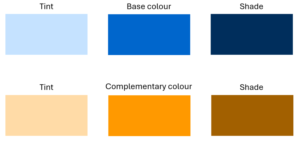
Color isn’t just about aesthetics; it serves a functional purpose in presentation design. It can be quite difficult to choose a set of colors that work well together. Here’s a simplified strategy for choosing a great set of 6 colors:
- Pick a Base Color: Pick any color you like, but make sure that it contrasts well with both white and black text.
- Create Variations: From your base color, add a little bit of black to create a darker version (a shade), and add a bit of white to create a lighter version (a tint).
- Find a Complementary Color: Look for a color that is approximately opposite to your base color on the color wheel. For this complementary color, also pick a shade and a tint.

Now you have a palette of 6 colors ready to use in your presentation design! The last step is to assign functions to each color and use these functions consistently throughout the presentation. For example, you could decide to use the base color as the background of boxes you would like to emphasize, and tint version of the complementary color for highlighting text.
If the above technique does not work for you, don’t worry. There are plenty of color palette generators available online to help you create harmonious color schemes for your presentation.
Conclusion
Don’t feel pressured to be a graphic design pro from the start. Think of these design principles as a toolkit to refine and enhance your presentations. The next time you’re faced with a blank slide, use this knowledge to organize your content effectively and create presentations that leave a lasting impression through impactful presentation design.


